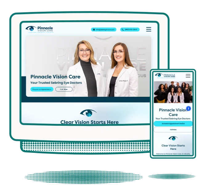
The landing page for TipTree.io is shown in a retro style monitor.

Strategic Web Design

Web Designs that

Custom sites help to increase conversion
rates, engage your audience,
and better connect with that audience.

Green Checkmark

Never Template Designs

Green Checkmark

Hosting Options Available

Green Checkmark

UX Strategy Implemented

Convert.
Grab.
Speak.
Entice.
Resonate.
Work.

Web Design Process

01.

Briefing

You fill out a brief that tells me everything I need to know about your business, your target audience, and your market. This information allows me to create a strategic plan to maximize conversion on your website.

02.

Analysis

I review the information provided in the brief you filled out and any branding or website assets that are being used. I research your market and your target audience and create a plan based on that research.

03.

Prototyping

Now it's time to implement the overall strategy into a website. This process begins with a wireframe and ends with a full prototype that allows you to see your website before we begin developing. This process allows us to make massive changes to create better flow, engaging user interface, and a clear user journey that guides the user to complete the goal of the website.

04.

Visual Analysis

The visual analysis is the review of the prototype for the following:

Green Checkmark
Use of color, texture, sizing
Green Checkmark
Consider the context of the visual elements
Green Checkmark
What meaning does the viewer take from this site
Green Checkmark
Consider your own response to the work, strengths and weaknesses
05.

Push it Live

After the approved prototype is developed, there's nothing left but to take it live and show it off.

Ready to get started?

Fill out a short form and get a quote within 24-hours (M-F).
All quotes are customized for your specific business needs and start from $1,500.

Get a Quote
Cartoon hand pointing down.
Hemingway Woodshop Website Design & Development | Branding | Abbi Mercer Web design create for Restore Neuro Rehab Center in Barrington, Illinois. Create by AMUX Designs - Abigail Mercer - Website DesignFlighty Fowl Website Design  | Colorado Springs | AMUX Designs TheraTec Inc Website Design & Development | AMUX Designs | Abbi MercerEndo Water Web Design | Abigail Mercer UX Designs Proficio ASP Web design and branding | Abigail Mercer | AMUX DesignsGreat Grandson of a Slave Web Design & Brand Identity | Georgia | AMUX DesignsHemingway Woodshop Website Design & Development | Branding | Abbi Mercer Web design create for Restore Neuro Rehab Center in Barrington, Illinois. Create by AMUX Designs - Abigail Mercer - Website DesignFlighty Fowl Website Design  | Colorado Springs | AMUX Designs TheraTec Inc Website Design & Development | AMUX Designs | Abbi MercerEndo Water Web Design | Abigail Mercer UX Designs Proficio ASP Web design and branding | Abigail Mercer | AMUX DesignsGreat Grandson of a Slave Web Design & Brand Identity | Georgia | AMUX DesignsHemingway Woodshop Website Design & Development | Branding | Abbi Mercer
This is the application design for a fan funnel for TipTree.io. The goal of this was to get people to scan a QR code with the intent to tip artists/musicians and gather their email address to build their fan following.

Why invest in UX Design?

Retro cartoon hand holding a magnifying glass. The hand moves closer and the heart gets bigger. This is a GIF to show search engine optimization for website designs.

Better SEO

When the user has a positive experience with a website design, they are more likely to stay on your website instead of navigating away.

Animation of a ball bouncing in and out of the frame

Lower Bounce Rate

Google changed their algorithm in March 2024 to account for the Usability of a website. If your site provides poor UX for your users, you won't be pushed to the top of search results.

AMUX Designs Atticus's retro cartoon hand snapping. Shows high conversion on website designs created by Abigail Mercer.

Higher Conversion

Solid user experience on a site not only leads to more engagement from the user, but there is a significantly higher chance of the user completing the goal of your site.

"I highly recommend Abbi to anyone seeking top-notch web design services from a creative and talented designer!"

-Theratec Inc

Cartoon hand pointing down.

All Packages are Customized

AMUX Atticus - a retro mascot for AMUX Designs pointing at the pricing for web design and brand identity.

Book a Call with Abbi

Want to get to know Abbi and the process of AMUX Designs? Schedule a 15-Minute Call Today.
Book My Call

Web Design & Development

I create websites designed around your market, users, and the goal of your site. No Templates. All customized for success. Investment begins at $1,500.

Green Checkmark

No Templates

Green Checkmark

Hosting Options Available

Green Checkmark

UX Strategy Implemented

Get a Free Quote

Follow the prompt below to fill out a brief form.
Once the quote request has been submitted, you'll get a quote within 24 hours.

Fill Out Form
Cartoon hand pointing down.

"Our woodshop has seen a 35% increase in sales since the launch of our new website. Highly recommended!"

-Hemingway Woodshop

Case Studies

Landing page web design for the Booking dashboard for music agents. Created for TipTree.io - St. Paul, MN.
22.6%
Increase in
Conversion

TipTree.io

The Challenge:

They needed to better communicate with their audience. Their site was riddled with user experience issues and confusing messaging. This lead to a high bounce rate, and low conversion rate.

The solution:

I created a new landing page design that condensed long wordy paragraphs into call outs so the user could make better sense of what TipTree had to offer. I re-designed the overall flow of the site to guide the user into signing up for the platform, rather than overwhelming the user with too much information that wasn’t properly organized.

Green Checkmark

Improve Conversion

Green Checkmark

Lower Bounce Rate

Green Checkmark

Improve Visual Design

The Numbers:

They performed an A/B test with my design and the previous and found a 22.6% increase in number of people who signed up for their platform in under 4 days time. This lead to them having me redo the user experience and the user interface of the dashboard within their platform as well. This is an on-going project.

View Live Site
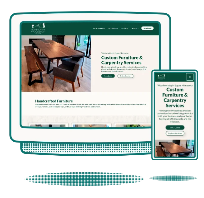
Hemingway Woodshop Website Design & Development | Branding | Abbi Mercer
42%
Increase in
Leads
39%
Increase in
Conversion

Hemingway Woodshop

The Challenge:

Their old site design focused too much on galleries. This lead to a slow site with low conversion and a lot of confusion. They wanted to showcase their work so it was simple for a customer to find samples of a specific project they are looking to request. They are a custom craft, which means they needed people to request a quote from their site. Their previous site, didn’t lead users to request a quote or a meeting which meant the site wasn’t doing its job.

The solution:

I moved their site from Wix to Webflow to accommodate larger galleries without sacrificing speed. I then geared every aspect of the site to focus on simple navigation to find specific projects and put in project requests.

Green Checkmark

Ease of Use

Green Checkmark

Improve Lead Generations

Green Checkmark

Easy to Nav Galleries

The Numbers:

Since launching their new site back in October of 2023, they reported an increase in leads by 42% and reported a 39% increase in closing sales. They are now subscribers to my design subscription and we are working on the design of their retail shop, opening in spring, 2024.

View Live Site
TheraTec Inc Website Design & Development | AMUX Designs | Abbi Mercer

TheraTec Inc.

The Challenge:

Their old site was created by Bullseye Media in Minnesota. It was riddled with both visual design errors and user experience errors. Their sales people reported visitors were confused by their site and didn’t understand the technology TheraTec had to offer.

The solution:

I scraped the entire design created by Bullseye Media. Their new site design is branded properly and shows the technology they talk about, rather than showing images that had nothing to do with their business. We focused on providing information based on research to improve their conversion and the overall visual design. Their target audience: PT Clinicians.

Green Checkmark

Branded

Green Checkmark

User Research

Green Checkmark

Sales Tool

The Numbers:

This new site design was launched February 2024.

View Live Site

Words from Clients

An image featuring the web design for the "THERATEC WEARABLE SENSOR" highlights three visuals. Key features include tracking physical therapy, measuring range of motion and reps, and real-time data communication with clinicians via Bluetooth—seamlessly integrated into an intuitive user experience design. Located in Saint Paul, MN.
"I highly recommend Abbi to anyone seeking top-notch web design services from a creative and talented designer!"
-Kerri Byers
Theratec Inc.
A magazine advertisement for Atlantic Bedding & Furniture. Designed by Abigail Mercer. Graphic Design - Print Design.
"She created an entire brand identity standard for us and followed through on several incredible designs for multiple types of media."
-Christina Tonoco
Atlantic Bedding & Furniture
An image of the web design detailing the therapeutic approach at Restore Neurorehab in Chicago, Illinois. It includes their specialized services: Physical Therapy, Occupational Therapy, and Speech Therapy. A commitment to personalized treatment for neurological conditions is emphasized.
"Abbi is one of those rare individuals that works her right and left brain equally well.  She's knowledgeable, organized and prompt.  She  brings creative genius to the process."
-Mark Fasik
Restore Neuro Rehab
The landing page for the original design of REMastered Sleep. It shows the above the fold section of the website with call to actions such as "shop now" and "learn about myofunctional therapy". The design has a blue to purple gradient background.
"Abbi has done such a wonderful job and we have really enjoyed working with her! We would highly recommend her for any website and design needs."
-Anderson Olmanson
CEO REMastered Sleep
Luminary Divorce Coaching Logo. A circle withe the letters "LDC" in the center. There is an arrow that goes through the arrow at a 45 degree angle. It appears to be passing through the circle.
"Abbi is incredible. I love how my website turned out."
-Rachel Snow
Luminary Divorce Coaching
An illustrative animation of a woman suffering from brain fog. Monoline - Minimalism Style. For Restore Neuro Rehab Center
"She went above and beyond by anticipating our needs and explaining the nuances to providing a strong user experience. If you know what you want but don't know how to get there, Abbi will make it a reality."
-Chad Cunningham
Restore Neuro Rehab

Words from Clients

An image featuring the web design for the "THERATEC WEARABLE SENSOR" highlights three visuals. Key features include tracking physical therapy, measuring range of motion and reps, and real-time data communication with clinicians via Bluetooth—seamlessly integrated into an intuitive user experience design. Located in Saint Paul, MN.
"I highly recommend Abbi to anyone seeking top-notch web design services from a creative and talented designer!"
-Kerri Byers
Theratec Inc.
A magazine advertisement for Atlantic Bedding & Furniture. Designed by Abigail Mercer. Graphic Design - Print Design.
"She created an entire brand identity standard for us and followed through on several incredible designs for multiple types of media."
-Christina Tonoco
Atlantic Bedding & Furniture
An image of the web design detailing the therapeutic approach at Restore Neurorehab in Chicago, Illinois. It includes their specialized services: Physical Therapy, Occupational Therapy, and Speech Therapy. A commitment to personalized treatment for neurological conditions is emphasized.
"Abbi is one of those rare individuals that works her right and left brain equally well.  She's knowledgeable, organized and prompt.  She  brings creative genius to the process."
-Mark Fasik
Restore Neuro Rehab
The landing page for the original design of REMastered Sleep. It shows the above the fold section of the website with call to actions such as "shop now" and "learn about myofunctional therapy". The design has a blue to purple gradient background.
"Abbi has done such a wonderful job and we have really enjoyed working with her! We would highly recommend her for any website and design needs."
-Anderson Olmanson
CEO REMastered Sleep
Luminary Divorce Coaching Logo. A circle withe the letters "LDC" in the center. There is an arrow that goes through the arrow at a 45 degree angle. It appears to be passing through the circle.
"Abbi is incredible. I love how my website turned out."
-Rachel Snow
Luminary Divorce Coaching
An illustrative animation of a woman suffering from brain fog. Monoline - Minimalism Style. For Restore Neuro Rehab Center
She went above and beyond by anticipating our needs and explaining the nuances to providing a strong user experience. If you know what you want but don't know how to get there, Abbi will make it a reality.
-Chad Cunningham
Restore Neuro Rehab

Frequently Asked Questions

A cartoon hand pointing to the Right.
What are the web platforms that you build in?

The main platforms I develop / build in are: Webflow, Wix, and Framer. The choice depends on the necessary functionality of the website and the integrations needed for the project.

I do work with WordPress coupled with Divi or Elementor.
Contact me to discuss the pricing for a WordPress website.

A cartoon hand pointing to the Right.
Do you offer white label web design?

Yes. My subscriptions are perfect for agencies that are looking for routine help with their overflow web designs. Contact me with questions or check out subscriptions here.

A cartoon hand pointing to the Right.
How long does the average web design and development process take?

For service based sites, typically two weeks.
For e-commerce based sites, typically four weeks.

These timelines begin after the on-boarding call is complete and is also dependent upon the clients response time.

A cartoon hand pointing to the Right.
What if I need both branding and a website? Do you offer a combination package?

If you are looking to make a splash with your new business or need to revamp a current one, I suggest subscribing to AMUX. You will be able to get a full brand created, a website designed and developed, as well as any marketing materials you want to announce your brand and make some noise.

The best part? You can pause or cancel as soon as the project is complete.

A cartoon hand pointing to the Right.
How does user experience play into web design and development?

User experience design is the study of how a user interacts with a physical or digital product. Studies show, users are more likely to invest in products / services from brands that invest in UX Design as it provides better usability and ease of use.

With a return rate of up to $100 for every $1 spent on UX - it's hard to argue against investing in UX.

A cartoon hand pointing to the Right.
I'm looking for an application design - is this something you offer?

Yes. I offer application prototyping in Figma.

Applications require the users to be able to navigate the app seamlessly, understand the inherent actions, and provide a clear user flow. There is such a large range of use when it comes to application design and development.

This process is covered under my design subscriptions. You can sign up and get started within 24-hours.

A cartoon hand pointing to the Right.
Is there a limit to the number of designs I can request in a subscription?

Depending on your subscription, you can input one to two design requests at a time. If you have a large queue of design requests, you can input those ideas into the project management system, and we move through them as each request is completed.

Retro hand drawn illustration of a Calendar with a smirking face.

Schedule a 15-Minute Call

Need help picking the option that suits your business best? Schedule a quick call and get your questions answered.

Schedule A Google Meet
A retro cartoon hand pointing up.